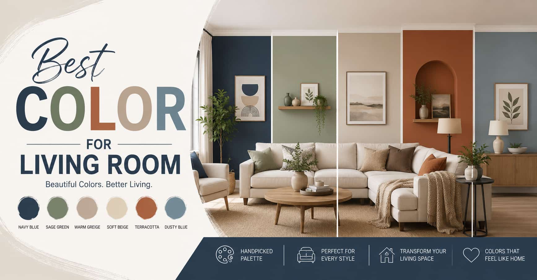
Choosing the right living room colour can feel harder than expected. Many homeowners paint a room thinking the colour will look perfect, but once it’s on the wall, the space can feel too dark, too plain, or just not right.
The good news is that paint is one of the easiest and most affordable ways to change the look and feel of your living room. The right colour can make the space feel brighter, bigger, warmer, and more welcoming. It can also make your furniture and décor stand out beautifully.
In this blog, we’ll share some of the best colors for living room for different styles, room sizes, and lighting conditions. Whether you have a modern apartment, a cozy family home, or a small living room that needs a fresh update, we will help you choose the perfect colour with confidence.
Table of Contents
Why Choosing the Right Living Room Colour Matters
Paint colour is more than just a background choice. It affects how your living room feels, how the space looks. Here’s why choosing the right colour matters.
Mood and Atmosphere
Colour psychology is real, and your living room is where it matters most. Warm tones like terracotta and cream encourage relaxation and conversation. Cool tones like navy and sage create a sense of calm. Neutrals give you flexibility but still carry emotional weight depending on their undertones.
Space Perception
Colour directly affects how large or small a room appears. Lighter shades reflect light and push walls outward visually. Deeper tones create intimacy but can make a room feel enclosed if used without care. Getting this right is especially important in typical Australian home layouts where the living room may be open-plan or modestly sized.
Lighting Conditions
Australian homes can be flooded with intense natural light in north-facing rooms or cast in deeper shadow in south-facing spaces. The same colour can look completely different depending on your aspect, the time of day, and whether you’re relying on warm LED globes or cooler downlights.
Home Style and Architecture
A chalky off-white that looks stunning in a Hamptons-style home might fall flat in a mid-century modern interior. Your living room colour should work with your architecture, your flooring, your furniture, and your existing finishes, not fight against them.
Resale Value
Choosing colours that are too plain can make your living room feel dull, while colours that are too bold may not appeal to everyone. The good news is that there are many paint colours that create the perfect balance of stylish, modern, and welcoming without feeling overwhelming.
Best Neutral Living Room Colours
Neutral colours are popular because they work with most styles and décor. But choosing the wrong shade can make your living room feel dull, cold, or flat instead of warm and inviting.
1. Beige
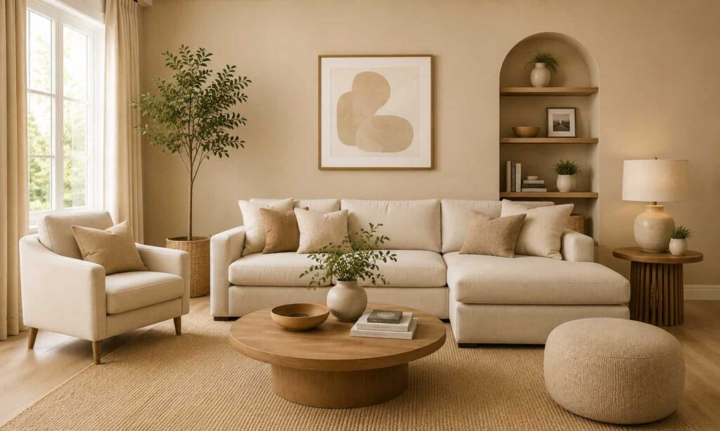
Classic beige has made a full comeback. Far from the dated mushroom beige of the nineties, today’s beige reads warm and grounded. It works particularly well in living rooms with timber flooring and natural materials. Look for beige tones with yellow or pink undertones rather than ones that lean green, those can turn muddy in certain light.
Good for: Traditional homes, coastal interiors, open-plan living areas.
2. Greige
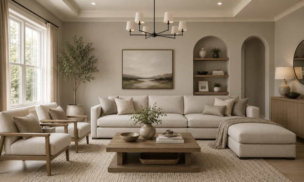
Greige, the blend of grey and beige is arguably the most versatile neutral you can choose. It picks up warmth in natural light and reads clean and contemporary under artificial lighting. It suits both modern and traditional home styles and pairs beautifully with both warm timber tones and cool concrete finishes.
Good for: Modern homes, open-plan spaces, homes with mixed finishes.
3. Soft White
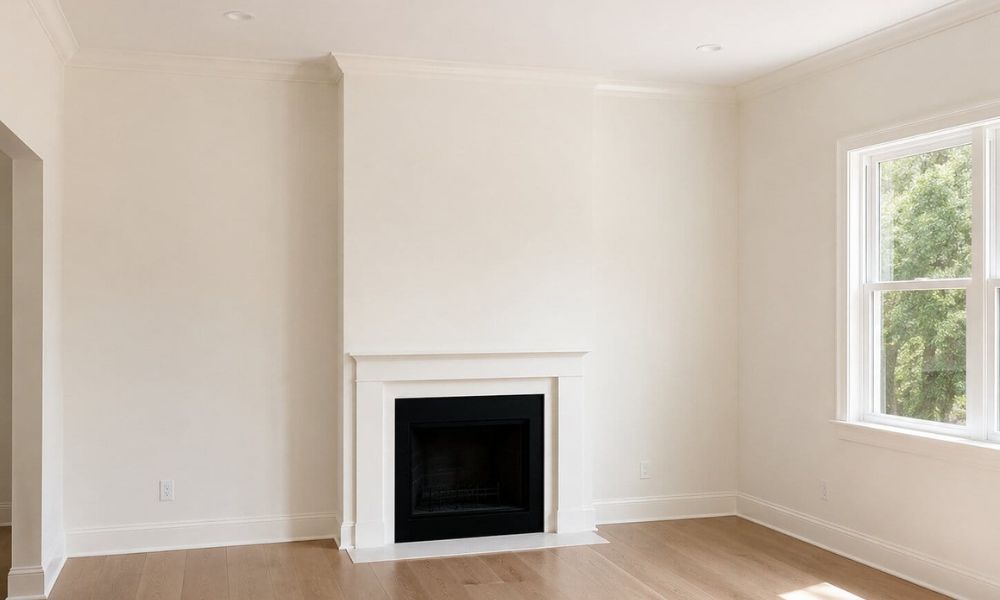
Not stark white, but a soft, layered white with warm undertones, think raw cotton or fresh cream. This kind of white makes a living room feel light and airy without the clinical edge of a pure white. It’s also a reliable choice for creating a gallery-like backdrop if you hang artwork.
Good for: Smaller living rooms, homes with good natural light, minimalist interiors.
4. Taupe
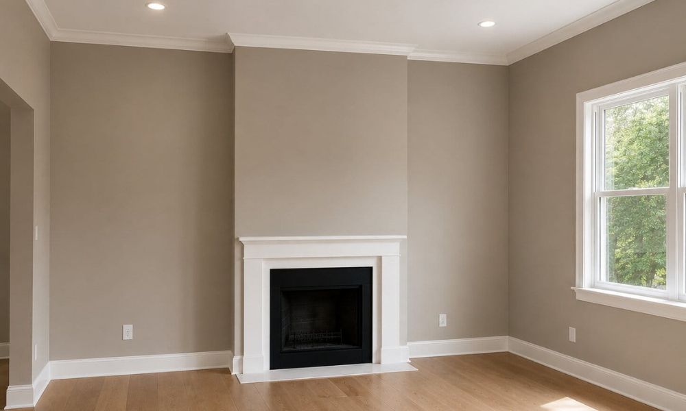
Taupe sits in that sweet spot between brown, grey, and beige. It’s sophisticated without being stark and lends a quiet elegance to the living room. Taupe works especially well in rooms with timber joinery, linen upholstery, and earthy accessories.
Good for: Formal living rooms, homes with natural material palettes, low-light spaces.
5. Light Grey
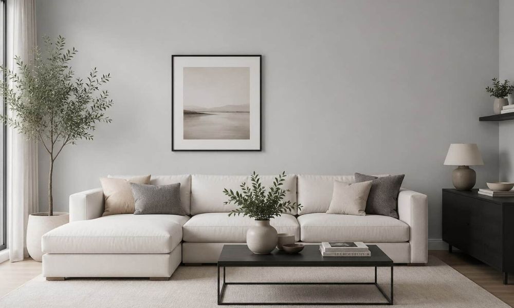
Light grey has been a popular neutral choice in Australia for years. While cool greys are becoming less popular, warm light greys still work beautifully. Choose shades with beige or soft green undertones instead of blue to keep the room feeling warm and comfortable.
Good for: Contemporary homes, apartments, open-plan spaces.
Best Warm Colours for a Cosy Living Room
If you want your living room to feel warm and welcoming, warm colours are a great choice. They add comfort, depth, and a cozy atmosphere when used the right way.
1. Warm Beige and Honey Tones
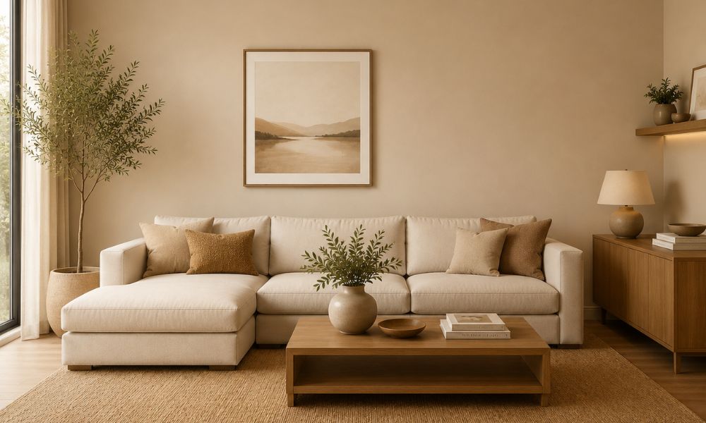
A warm beige with golden undertones can transform a living room into a genuinely inviting space. These tones pair naturally with rattan furniture, linen throws, and terracotta accents, a combination that feels both current and timeless. In rooms with strong natural light, honey-toned beige glows beautifully in the afternoon.
2. Terracotta
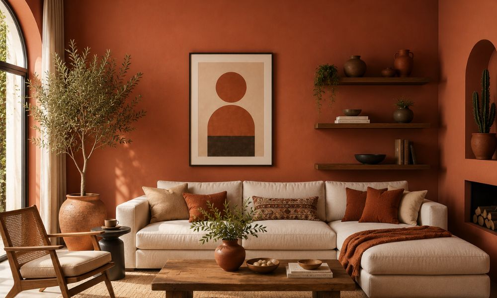
Terracotta has become one of the most popular living room colours in recent years, and its popularity continues to grow. Its warm, earthy tones can completely change the feel of a space. A terracotta feature wall creates a bold statement, while using it throughout the room adds a rich and cozy atmosphere.
It works beautifully with olive green, cream, natural wood, and brass accents. In homes inspired by Mediterranean or modern coastal styles, terracotta feels especially warm and inviting.
3. Cream
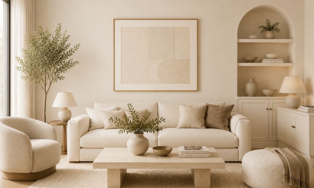
Cream is softer and warmer than white, with a natural, almost organic quality. It’s one of those colours that flatters almost every furniture style and works across seasons, cool and clean in summer, warm and cosy in winter. If you’re nervous about going bold, cream is often the colour that makes the biggest impact for the least risk.
4. Warm Brown Tones
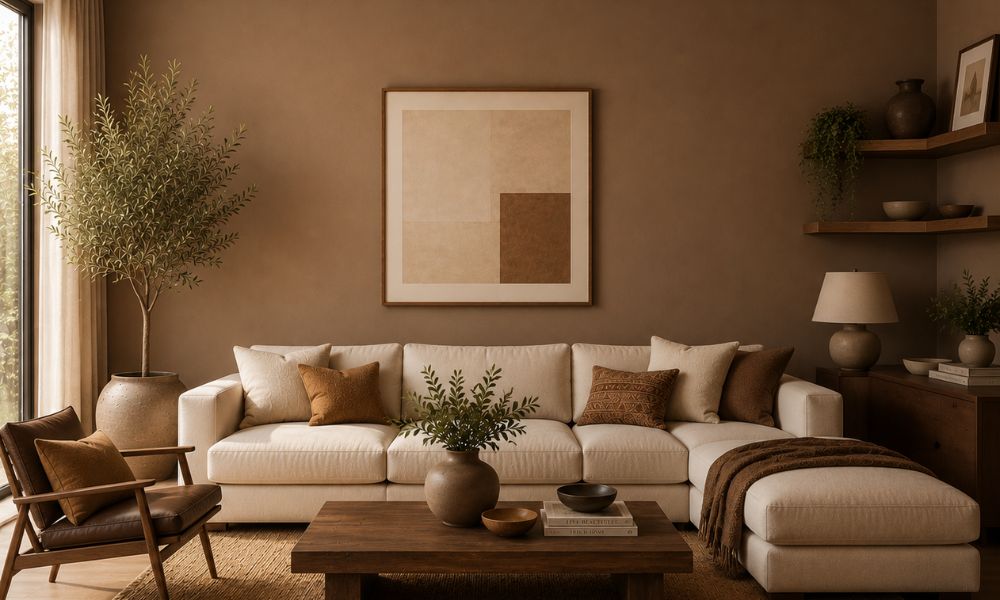
Deep caramel, warm chocolate, and dusty mocha are emerging as sophisticated choices for living rooms where comfort and character are the priority. These tones work especially well in rooms with higher ceilings and work brilliantly as a full-room colour rather than just an accent. Pair them with off-white trim and timber furniture for a grounded, refined look.
Best Modern Living Room Colours
Modern living rooms tend to move away from traditional neutrals toward colours with more personality, tones that feel deliberately chosen and architecturally aware.
1. Sage Green
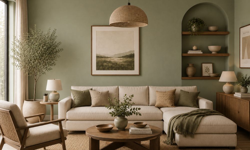
Sage green has become one of the most-loved modern living room colours in Australia, and it earns that status. It’s calming without being bland, natural without being earthy, and sophisticated without being cold. Sage works in everything from period homes to new builds and pairs effortlessly with timber, concrete, stone, and linen.
2. Charcoal
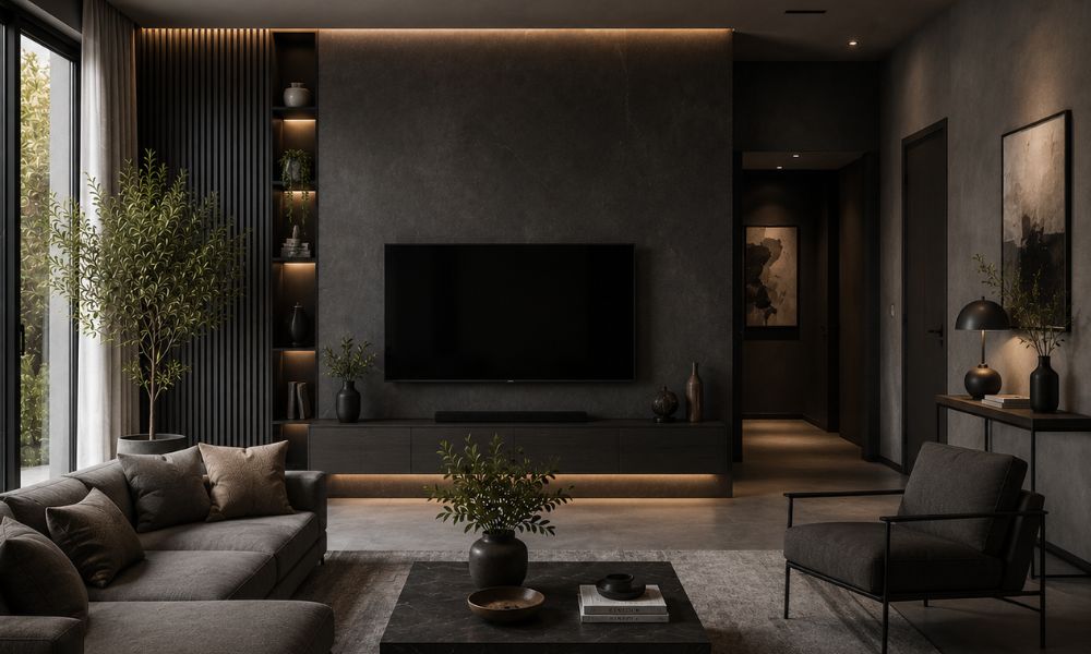
When used the right way, charcoal can create a bold and stylish living room. Its deep colour adds a dramatic, cozy feel and helps furniture, artwork, and lighting stand out more than lighter walls do. To keep the room balanced, pair charcoal walls with lighter furniture, natural wood, or warm metallic accents like brass.
Charcoal works best as a feature wall or in living rooms with plenty of natural light, as darker colours can make small or dim spaces feel even smaller.
3. Navy Blue
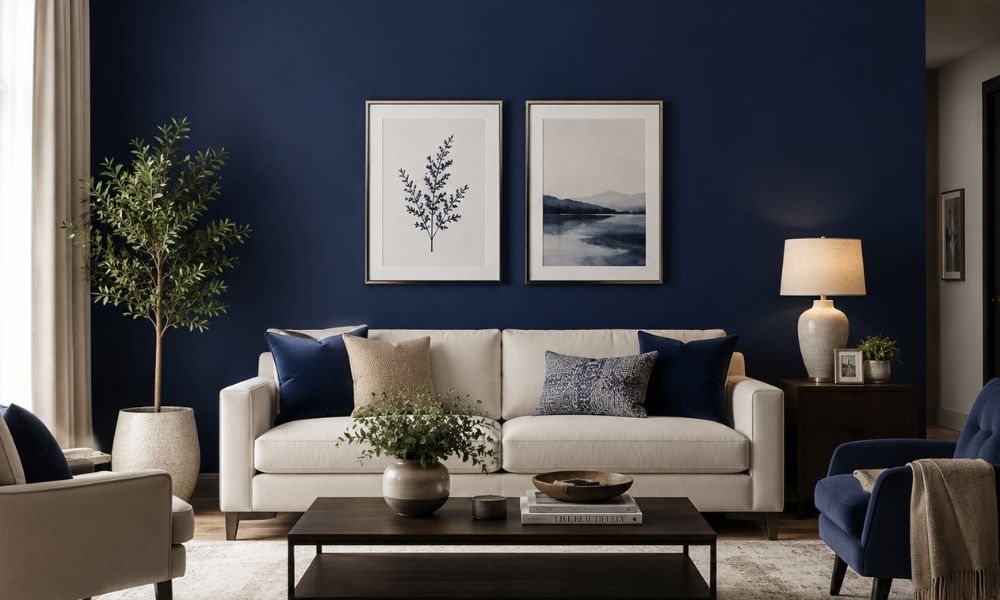
Navy is a timeless and elegant colour that works well in many living room styles. It feels classic in traditional homes while still looking modern in contemporary spaces. Navy pairs beautifully with natural fabrics, warm wood tones, and brass or gold accents. It also looks great alongside rust and terracotta shades for a richer, more layered look.
4. Earth Tones
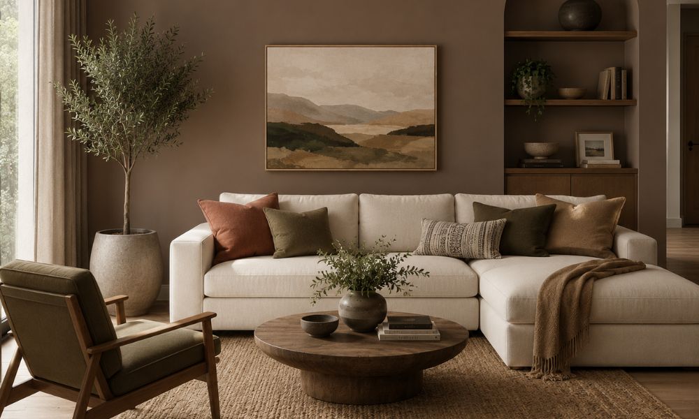
Earth tone colours like warm ochre, olive green, clay pink, and burnt orange are becoming very popular in Australian homes. These colours feel natural, warm, and relaxing because they are inspired by the outdoors. If you want more inspiration, our guide on living room paint colour ideas cover these shades in more detail.
Colours That Make a Living Room Look Bigger
If your living room is on the smaller side, or simply feels more enclosed than you’d like, colour can help. These strategies genuinely work.
Use light neutrals: Pale tones reflect more light and prevent walls from visually closing in. Soft beige, warm white, and pale greige are reliable choices that won’t make a small room feel sterile.
Go for soft white on the ceiling too: Using the same colour on the ceiling and walls, or a slightly lighter shade on the ceiling, helps the room feel more open and spacious.
Consider pale grey: A light grey with warm undertones can make a small living room feel larger and brighter. It reflects light well while keeping the space calm and balanced.
Avoid high-contrast combinations: Dark feature walls can look stylish in small living rooms, but they may also make the space feel smaller. Bold dark colours usually work better in larger rooms.
Use a single colour throughout: Painting walls, joinery, and trim in the same or similar tone creates a seamless, expansive look. This monochromatic approach is one of the tricks interior designers rely on most in compact spaces.
Trending Living Room Colours for 2026
The 2026 colour landscape in Australian interiors is leaning heavily into nature, quiet luxury, and warmth. Here’s what’s resonating right now.
Nature-inspired tones are leading the trend conversation: mossy greens, warm stone, weathered clay, and sun-bleached ochre. These colours feel grounding in a way that pure greys and crisp whites don’t.
Organic neutrals specifically warm whites, sandy beiges, and natural linens are outperforming cooler, starker neutrals. Australians are increasingly drawn to palettes that feel connected to the natural environment rather than at odds with it.
Deep accent colours are being used more boldly. Midnight blue, forest green, and rich terracotta are moving from feature walls into full-room treatments in larger living spaces. The key is balancing them with natural textures and light-coloured joinery.
Off-black and deep charcoal colours are becoming more popular, especially in modern renovations and designer homes with higher ceilings that can handle darker, dramatic tones.
How Lighting Affects Living Room Paint Colours
This is the part most homeowners skip and it’s why so many paint colours end up looking wrong despite good intentions.
Natural Light
The amount of natural light your living room receives changes everything. A sun-drenched north-facing room will warm up almost any colour, making even cooler greys feel liveable. A south-facing room with limited direct sunlight will accentuate cool undertones and make colours read darker and bluer than they appear on a swatch.
General rule: The less natural light your room gets, the warmer your undertones should be.
Room Aspect in Australia
In Australia, north-facing rooms receive the most consistent natural light year-round. East-facing rooms get bright morning light that softens in the afternoon. West-facing rooms can be intense in the late afternoon. South-facing rooms are typically the most light-challenging.
- North-facing: Most colours will work, you have flexibility.
- South-facing: Avoid cool blues, stark whites, and pure greys. Lean into warm neutrals and soft earth tones.
- East-facing: Morning-lit spaces suit fresh, light colours. Avoid heavy dark colours.
- West-facing: Evening light is warm and golden, rich tones like terracotta and caramel perform beautifully.
Mistakes to Avoid When Choosing Living Room Paint Colours
Even experienced renovators make these mistakes. Here’s how to sidestep the most common ones.
- Choosing a colour that’s too dark for the space: Deep colours can be stunning, but they require adequate ceiling height, natural light, and balanced furniture. Going dark in the wrong room just makes it feel smaller and heavier.
- Ignoring undertones: Paint colours have undertones often green, blue, yellow, or pink that only become visible on the wall. A grey with green undertones can look aqua in certain light. A beige with pink undertones can look blush against certain flooring. Always look at undertones before committing.
- Skipping paint samples: Choosing directly from a colour card or a screen is the most common cause of paint regret. Colours shift dramatically based on your specific walls, light source, and surrounding elements. Sample pots are inexpensive and genuinely worth the effort.
- Following trends too literally: Trends are useful as inspiration, not instruction. If a trending colour doesn’t suit your home’s aspect, architecture, or your personal taste, it’ll feel wrong regardless of how popular it is.
- Forgetting about paint finish: For living rooms, low-sheen or satin paint finishes are usually the best choice. They offer a soft look without highlighting wall imperfections like high-gloss finishes can. The paint finish can change the overall appearance of the colour just as much as the colour itself.
How to Choose the Right Colour for Your Home Style
Different home styles suit different paint colours. Here’s a simple guide to help you choose the right look.
Modern and Contemporary Homes
Lean into warm neutrals, greiges, sage greens, and deeper tones like charcoal or navy. Avoid anything too fussy or ornate. Clean colour palettes with well-chosen accents tend to work best.
Traditional and Period Homes
Federation, Edwardian, and Victorian homes suit warmer heritage tones like deep creams, warm whites, taupe, olive, and navy. Look at the original architecture for colour cues: lead light colours, timber stain tones, and original tile work often point you in the right direction.
Farmhouse and Coastal Interiors
These styles love texture and warmth. Think chalky whites, warm linen tones, soft sage, and natural beige. Avoid anything too polished or high-contrast, the goal is relaxed and layered rather than slick.
Open-Plan Living Areas
When your living room flows into the kitchen and dining area, colour continuity matters. Stick to a unifying neutral that reads consistently across different light sources in the same space, then add character through furniture and accessories.
Conclusion
Choosing the best colors for living room is about finding a shade that works well with your space, lighting, and personal style. Whether you prefer warm terracotta, calming sage green, classic greige, or bold navy, the right colour should make your room feel comfortable and inviting.
Before painting, always test samples on your walls and check how they look throughout the day, as lighting can change the appearance of a colour. Also consider your ceiling, trim, and furniture when choosing paint. If you want a smooth, professional finish and expert advice on colours and finishes, working with experienced painters can help bring your vision to life perfectly.
Frequently Asked Questions
What is the most popular living room paint colour in Australia?
Warm neutral colours like greige, soft white, and warm beige are still some of the most popular choices for living rooms in Australian homes. In recent years, sage green and terracotta have also become trendy options, especially in renovated and modern-style interiors.
Which colours make a living room look bigger?
Soft whites, pale beiges, and light warm greys are the most effective choices for making a living room look larger. The key is choosing colours with warm undertones that reflect light naturally rather than cool tones that can make walls feel closer. Keeping walls, trim, and ceiling in the same tonal family also creates a more expansive effect.
Are grey living rooms still in style?
Cool-toned grey colours are becoming less popular in Australian interior design. Instead, homeowners are choosing warmer greys with beige, taupe, or soft green undertones. These shades feel more comfortable, inviting, and easier to live with than cold, stark greys.
What colours make a living room feel cosy?
Warm, enveloping tones are the key to cosiness. Terracotta, warm cream, honey beige, caramel, and deep earthy tones all create that wrapped-in-warmth feeling. These colours work best with soft furnishings, layered textiles, and warm lighting to reinforce the sense of comfort.
What is the best neutral colour for a living room?
Greige, a mix of grey and beige, is one of the most versatile neutral colours for living rooms. It feels warm in natural light, suits both modern and traditional homes, and works well with timber floors, stone surfaces, and many furniture styles. If you prefer a slightly warmer look, soft taupe or warm cream are also great and dependable choices.
Do I need to consider my floor colour when choosing a living room paint colour?
Yes, your flooring affects how paint colours look. Warm timber suits earthy tones and warm neutrals, while concrete or tiles work well with cooler shades. If your flooring has strong undertones, choose wall colours that intentionally complement or contrast with them.