Finding the best colour schemes for weatherboard house painting is one of the most impactful decisions you’ll make as a homeowner. The right palette boosts curb appeal, increases property value, and helps your home feel like it truly belongs whether that’s a leafy suburb, a coastal street, or a country township.
Weatherboard homes are among Australia’s most loved architectural styles, and their charm only shines when the colours work with the home, not against it.
As professional painters who’ve worked on hundreds of weatherboard exteriors across regional and metro Australia, we know colour selection goes beyond aesthetics, it’s about light, climate, and long-term performance. This guide covers everything you need to make a confident decision.
Table of Contents
Why Weatherboard Exterior Colours Matter More Than You Think
The colour scheme of your weatherboard exterior does far more than make a visual impression. It reflects your personal style, interacts with the natural light of your block, and sets the tone for how your home fits within the streetscape. In the Australian context, colour choice also carries practical weight.
Our harsh UV radiation can cause lighter paints to chalk and darker colours to fade significantly within just a few years if you’re not using quality, UV-resistant exterior coatings. The right paint combined with the right colour can mean the difference between a repaint every five years and one that lasts a decade.
From a resale perspective, homes with well-considered, neutral-to-classic exterior palettes consistently attract stronger buyer interest. Bold or highly personalised colour choices can polarise buyers, something worth keeping in mind if you’re painting with future resale in mind.
Classic and Timeless Weatherboard Colour Combinations
Let’s begin with the tried-and-true combinations that have stood the test of time. These palettes work beautifully on weatherboard homes because they complement the material’s natural texture without competing with it.
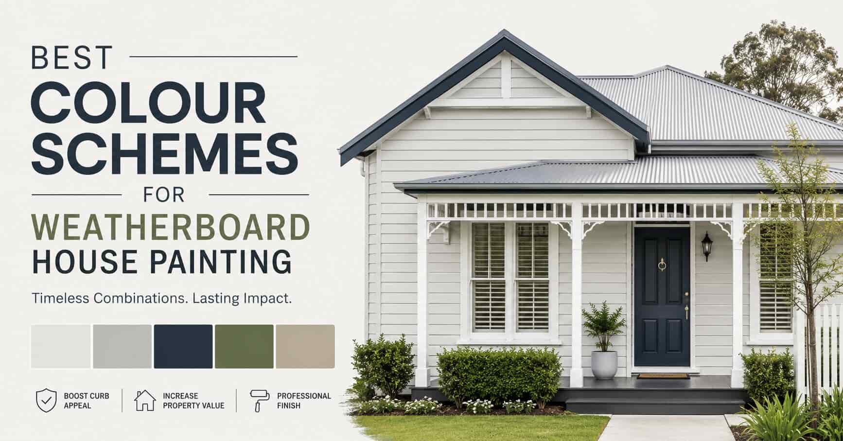
1. Classic White and Navy Blue

White remains the most popular choice for weatherboard homes and for good reason. It highlights architectural details, reflects harsh sunlight and delivers a crisp, clean appearance that never dates. White also provides an excellent base for showing off decorative trims, eaves, and verandah posts.
Paired with navy blue on trims, window frames, and fascias, this combination creates a great contrast that suits everything from coastal cottages to colonial Federation homes. The depth of navy grounds the brightness of the white and gives the home a polished, well-composed look.
From a painter’s perspective, this pairing is forgiving to apply and ages beautifully, particularly when using a quality low-sheen finish on the boards and a semi-gloss on the trims.
Roof pairing tip: Charcoal or slate grey Colorbond roofing works exceptionally well with this combination, adding a third anchor colour without disrupting the classic palette.
2. Soft Gray and Charcoal

Grey has earned its place as one of the most versatile and enduring weatherboard exterior colours in the modern era. A soft, warm grey as the primary board colour creates a calming, polished effect that blends seamlessly with most landscapes, whether you’re surrounded by established gum trees or urban hardscaping.
Adding charcoal accents on trims, soffits, and window reveals pulls the look together and adds definition to the home’s architectural lines. This combination suits contemporary and updated traditional homes particularly well and pairs beautifully with timber decking, black window frames, and feature stonework.
Roof pairing tip: A deep charcoal or monument-toned metal roof ties the whole look together cleanly.
3. Warm Beige and Olive Green

For homeowners seeking a more natural, organic palette that settles comfortably into the Australian landscape, warm beige paired with olive green is a beautiful option. Beige honours the warmth of timber weatherboards and creates a welcoming, sun-baked appearance that feels right at home.
Olive green colour brings in nature-inspired richness without being jarring — it connects the home to garden beds, native vegetation, and surrounding paddocks. This palette works especially well on country-style and farmhouse-influenced homes, where the goal is to feel rooted in the land rather than standing out from it.
Painter’s tip: Look for beige and olive tones in Dulux’s or Taubmans’ warmer neutral range paired with heritage green trims for an authentic result.
Bright and Bold Weatherboard House Colour Ideas
Sometimes a home calls for a stronger statement. Whether you’re in a beachside suburb or a heritage streetscape that welcomes personality, these bolder palettes can deliver real impact when executed with care.
1. Light Blue and Cream

Light blue is a natural choice for coastal and cottage-style weatherboard homes. It evokes open skies, cool ocean breezes, and the easy-going character of beachside living. Cream accents on trims, verandah posts, and fretwork soften the overall look and prevent it from feeling too cool or flat.
This coastal weatherboard colour scheme works particularly well in beachside suburbs across Victoria, NSW, and Queensland, where the palette mirrors the surrounding environment and feels effortlessly appropriate. It’s a pairing that photographs beautifully and tends to hold its appeal over time.
Finish tip: Use a quality exterior low-sheen on the boards and a full-gloss cream on timber trims, it makes the detailing really pop.
2. Bold Red and White Trim

Red is a choice that demands confidence, but when done well, it’s extraordinary. A deep heritage red on weatherboard cladding paired with crisp white trims creates a striking, high-contrast facade that draws the eye immediately.
This combination has strong historical precedent in Victorian and Federation-era Australian homes, where red brick was a dominant material and complementary red tones on timber were a natural extension.
Red doors, shutters, or feature gable ends against a neutral backdrop can have a similar effect without committing the entire home to a bold colour, a good middle ground for those who want impact with a little more restraint.
Important note from a painter’s perspective: Deep reds and burgundies tend to fade more noticeably under Australian UV than lighter colours. Always specify a high-quality, UV-stabilised exterior paint brand and be prepared for a touch-up or full repaint sooner than you might with a neutral palette.
Modern Weatherboard House Colour Trends in Australia
The exterior colour landscape has shifted noticeably in recent years, with homeowners increasingly moving away from traditional off-whites and heritage tones toward bolder, more considered palettes.
- Deep, moody tones: charcoal, slate, deep navy, and forest green have become particularly popular on contemporary weatherboard builds. When paired with black window frames, exposed timber accents, and minimal landscaping, these darker shades create a dramatic, architect-inspired look that photographs spectacularly.
- Two-tone facades: These are also gaining momentum, using one colour for the lower storey and a complementary or contrasting shade above. This approach adds visual interest and can be a clever way to modernise an older home without a full renovation.
- Warm whites and off-whites: Continue to dominate in most local suburbs, but homeowners are now choosing warmer, slightly yellow or pink-based whites over pure brilliant white. They’re more forgiving under harsh afternoon light and feel less stark in person.
Best Coastal Colour Schemes for Weatherboard Homes
Coastal environments call for specific colour thinking. Salt air, bright reflected light from nearby water, and a relaxed, holiday-inspired aesthetic all influence what works and what doesn’t.
For weatherboard homes near the coast, consider:
- Soft blues and seafoam greens paired with warm whites, fresh, airy, and in keeping with the environment.
- Sand and driftwood tones, warm, textured neutrals that mirror the beach setting beautifully.
- Pale aqua or duck-egg blue on boards with white trims, a gentle nod to the classic Australian beach house without being cliched.
- Sage green and off-white increasingly popular as a coastal palette with a slightly more elevated, contemporary feel.
From a practical standpoint, coastal weatherboard homes need paint that can stand up to salt-laden air. Always specify a quality exterior acrylic with strong moisture resistance. Products like Dulux Weathershield or Taubmans Endure Exterior are well-regarded for coastal conditions.
Hamptons Style Weatherboard Colour Ideas
The Hamptons aesthetic has found enormous popularity in Australian residential design over the past decade and weatherboard homes are perfectly suited to it.
The hallmarks of a Hamptons-style exterior include a predominantly white or pale grey palette, detailed trims particularly around windows, eaves, and verandah columns and a sense of relaxed but considered elegance. Common colour combinations include:
- Bright white boards with white or off-white trims, the purist Hamptons approach.
- Warm white boards with navy blue trims and shutters, a more classic coastal feel.
- Pale grey boards with white trims and a charcoal roof, a contemporary local climate take on the Hamptons look.
Hamptons-style homes rely heavily on trim detailing and architecture for their impact, the colour palette is deliberately restrained so that the work takes centre stage. If your home has verandahs, columns, fretwork, or bay windows, a Hamptons palette will showcase all of that beautifully.
How to Choose the Right Roof and Trim Colours
Many homeowners spend a great deal of time thinking about board colour and comparatively little time thinking about trim and roof, but these elements are just as important to the overall result.
Trim colours (window frames, fascias, bargeboards, verandah posts) act as the defining lines of your home’s facade. As a general rule:
- White or off-white trims are the most versatile and suit almost any board colour.
- Matching trims to the board colour creates a more modern, monochromatic effect.
- Contrasting dark trims (charcoal, black, navy) on a light board colour add bold definition and suit contemporary styles.
Roof colour should match the palette, not fight with it. Colorbond roofing gives you a reliable, durable range of colours to work with. Popular pairings include:
- White or light grey boards → Colorbond Basalt, Ironstone, or Surfmist
- Dark board colours → Monument, Wallaby, or Woodland Grey
- Heritage palettes → Cottage Green, Manor Red, or Paperbark
If you’re unsure, bring a physical roof sample alongside your board and trim samples, seeing all three together in natural light is the most reliable way to confirm a palette before committing.
Mistakes to Avoid When Choosing Exterior Weatherboard Colours
Even experienced homeowners can fall into these common traps. Knowing what to avoid is just as valuable as knowing what to choose.
- Testing swatches only indoors: Paint colours look dramatically different in natural light and Australian sunlight is particularly unforgiving. Always test swatches on the actual exterior wall and observe them at different times of day.
- Choosing colours purely from a brochure or screen: Printed and digital representations of paint colours are often quite inaccurate. Always get large physical samples before making a final decision.
- Ignoring the fixed elements: Your roof, driveway, path pavers, brickwork, and even your neighbour’s home colour are all fixed elements that your colour scheme needs to work with. These should be the starting point, not an afterthought.
- Going too dark without considering heat: Very dark colours absorb significantly more heat on exterior surfaces, something that matters in local climate. This can also accelerate paint degradation over time. If you love dark colours, ensure the paint you use is specifically formulated for darker exterior use.
- Over-matching everything: A completely monochromatic exterior with identical tones across boards, trims, and roof can look flat. Strategic contrast always adds life to a facade.
Best Paint Finishes for Weatherboard Exteriors
The finish you choose for your weatherboard home affects both its appearance and its durability. Here’s what most professional painters recommend:
- Low-sheen or low-lustre on the main weatherboard surface, it hides minor imperfections, gives a quality appearance, and performs well in the long term.
- Semi-gloss or gloss on timber trims, window frames, and doors, the higher sheen makes cleaning easier and gives crisp definition to architectural details.
- Avoid flat/matte finishes on exterior applications, they’re harder to clean and tend to degrade faster in Australian conditions.
For UV protection, look for paints specifically marketed for exterior use with UV-resistant properties. In particularly sun-exposed locations, northern and western-facing walls especially, this is non-negotiable.
Tips for Choosing the Right Weatherboard Colours
These practical principles apply regardless of the style or palette you’re leaning toward:
Match the architectural style: Traditional weatherboard homes generally suit classic neutrals and heritage palettes. Contemporary builds can carry bolder, more dramatic colour choices. Fighting the architecture rarely works.
Consider the surrounding landscape: Homes surrounded by native bush often look better in earthy, natural tones. Coastal homes suit lighter, airier palettes. Urban homes have more flexibility but should still respect the streetscape.
Think about how your home is oriented: South-facing walls receive less direct sun and can make colours look cooler and darker than expected. North and west-facing walls will be bathed in warm afternoon light, which can intensify warm tones.
Get a professional colour consultation: Most professional painting companies offer colour consultation as part of the quoting process. This is genuinely worth doing, an experienced painter has seen hundreds of colour decisions play out in reality, and that knowledge is invaluable.
Professional Consultation and Execution
While DIY painting projects can be fulfilling, consulting with a professional painter nearby ensures expertise and precision in achieving flawless results.
Professional painters can offer valuable advice on color selection, preparation, application techniques, and maintenance, ensuring your weatherboard house looks its best for years to come.
Ready to embark on your weatherboard house painting journey? You can contact us today and explore more color options that suit your style and home’s architecture. Transform your weatherboard house into a masterpiece that reflects your personal taste and enhances the beauty of your neighborhood.
FAQs
What is the best colour combination for a weatherboard house exterior?
Classic white with navy trim, soft grey with charcoal, and warm beige with olive green are timeless choices that enhance curb appeal and architectural charm.
How do I choose a colour scheme for my weatherboard house?
Consider your home’s architectural style, surrounding landscape, and lighting. Testing paint swatches in different conditions helps ensure the right choice.
Which colour is best for a weatherboard home exterior?
White is a versatile favourite, while soft greys and earthy tones blend well with natural surroundings. For bold looks, navy, red, or olive green add character.
How many colours should I use on my weatherboard house exterior?
A three-colour scheme works best: one for the main weatherboard, a second for trims, and a third for accents like doors and shutters.
What is the most attractive colour for a weatherboard house?
White with contrasting trims (navy, charcoal, or beige) is a popular and elegant choice, offering a sophisticated yet timeless appeal.